Project
Digital agency identity system. Rebuilt as a framework.
The identity system for CPR Interactive was designed by Wilson Gheur during his time as Creative Lead. The brief was to rethink the existing visual identity and build a structured framework capable of supporting the agency’s growth across internal teams, client presentations, and new-business efforts.

Overview
Redefining the identity around how the work actually happens.
CPR Interactive had evolved significantly since its existing identity was created. The agency had grown across teams, disciplines, and channels, creating new demands that its visual foundation had not originally been designed to address. As the operation expanded, interfaces, presentations, and internal documents required a more structured and adaptable system.
The core identity was rebuilt from within, including logo, typography, and color architecture, to function as a stable framework rather than a collection of stylistic decisions. The goal wasn’t a surface refresh, but a system capable of surviving handoff, scaling across formats, and supporting multiple teams without constant reinvention.
Identity System
A triangle shaped around how the work happens.
The identity is anchored by a geometric triangle that reflects three core disciplines driving the agency’s work: interaction design, development, and motion. Instead of combining literal arrows, brackets, and play icons, the symbol distills their underlying ideas of direction, structure, and movement into a single, minimal form that is easy to recognize and easy to use.
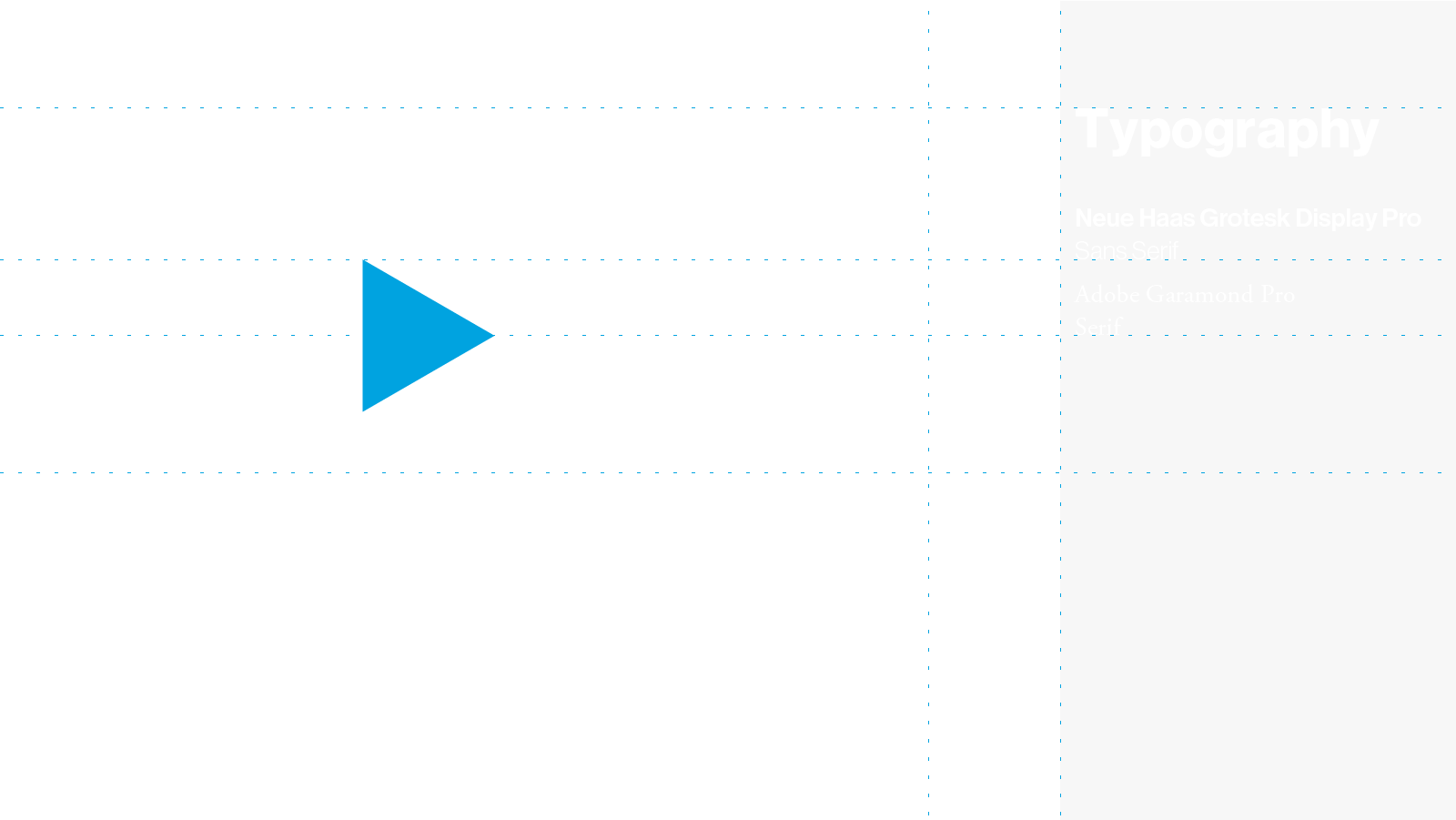
The geometry follows a simple internal logic. The triangle’s proportions were refined so its edges read with consistent optical weight, giving the symbol stability at both small and large scales. It holds up in UI, in presentations, and in tight digital spaces without requiring constant adjustments or alternate versions.
The wordmark sits deliberately in contrast. Clean sans-serif, consistent spacing, no visual tricks. It was designed to support the triangle, not compete with it, creating a pairing that feels balanced and steady.
Clear-space rules and a small set of predefined lockups ensure the identity stays coherent when different people apply it. The system is flexible where it should be and fixed where it needs to be, supporting consistent use across teams and over time.

Color and type built for consistency.
Color
The color system is built around a single bold accent, cyan, supported by black and white. From there, the palette extends into shades, grays, and a small set of secondary tones so the identity can move between UI, print, and motion without losing its core.
The way color is used matters more than how many swatches exist. Cyan provides emphasis, highlights, and key moments, while neutrals take care of structure, backgrounds, and typography. This balance keeps the identity from becoming noisy and makes it easier for teams to maintain contrast and legibility without having to rethink the palette on every project.

Typography
Typography follows the same idea. Neue Haas Grotesk Display Pro handles most of the work, including navigation, interface elements, decks, and internal documents, while Adobe Garamond Pro provides contrast and supports longer reading. Weights and sizes were defined as a simple hierarchy so the system could be applied quickly, without turning every layout into a new exercise in styling.
The result is a framework that behaves consistently in use, clear enough for handoff and open enough to support different executions without drifting into noise.
Result
A system that holds together long after handoff.
The outcome is a system that holds together without constant intervention. Once the logo, color architecture, and typographic structure were defined, the identity could be extended internally without drifting or requiring fundamental decisions to be reconsidered each time. The identity assets and usage guidelines were delivered to CPR, and the system was then extended across materials by the internal team. The foundation is the real result: a visual language that remains stable, scalable, and coherent over time.